
Today, we’re testing Alloy, Claude Design, Magic Patterns, v0, Lovable, Figma Make, and Framer with the same prompts to get the definitive answer to the best AI prototyping tool. The space is moving incredibly quickly, and most reviews have become too outdated to be useful. Our goal was to fix this.
I’m incredibly excited to run this experiment. I spent the last three years building AI prototyping tools, and before that I was a Senior Product Manager at Atlassian shipping changes to a product used by millions. So prototyping changes to products used by millions is something I know and care about more than most!
Skipping to the end, here are the final results:
| Tool | Initial | Iteration | Speed | UI Quality | Design System | Product Thinking | Total |
|---|---|---|---|---|---|---|---|
| Alloy | 25s | 3m 03s | 4 | 5 | 5 | 4 | 18/20 |
| Magic Patterns | 2m 56s | 1m 24s | 4 | 4.5 | 4 | 3.5 | 16/20 |
| Claude Design | 1m 02s | 1m 32s | 4.5 | 4 | 1 | 4 | 13.5/20 |
| Figma Make | 3m 12s | 1m 51s | 3.5 | 4 | 3 | 3.5 | 14/20 |
| Lovable | 2m 48s | 1m 18s | 4 | 3 | 1.5 | 3.5 | 12/20 |
| Framer | 12m 05s | 11m 08s | 1 | 4.5 | 3 | 3.5 | 12/20 |
| v0 | 7m 30s | Failed | 1 | 3.5 | 1 | 3.5 | 9/20 |
Now, let’s go through step by step.
Testing AI Prototyping Tools on a Real Product
Most AI prototyping comparisons start with a blank canvas: “build me a travel app,” “make a finance dashboard,” or “design a habit tracker.” That tests greenfield generation. It does not test the job product teams do every week.
Most real product work is not greenfield. It starts with: change this screen we already shipped. A PM proposing a new feature needs stakeholders to see that feature inside the product they already know—not in a new design language that happens to look polished.
So we gave every tool the same existing product and the same feature request. We chose Airbnb's homepage because it combines recognizable branding, a dense navigation system, product imagery, search controls, and repeating listing cards. It forces a tool to preserve an established visual system while introducing new UI.
Everything below reflects the August 2026 run of this test.
Seven AI Prototyping Tools Tested on the Same Existing Product
These tools are not identical products. Some are code generators, some are design environments, and Alloy starts from your product captured live from the browser. That difference is part of the test: product teams compare them for the same prototyping budget even when their underlying approaches differ.
How I Scored Speed, UI Quality, Design-System Fidelity, and Product Thinking
I scored four practical dimensions from 1–5:
- Speed: how long did the initial result and feature change take?
- UI quality: how polished and usable were the new button, modal, and invite flow?
- Design-system compliance: did the result preserve the reference's typography, spacing, assets, hierarchy, and component language while adding the requested feature without redesigning the page?
- Product thinking: did it make sensible choices where the prompt left room for judgment?
Test Conditions: Same Airbnb Reference, Same Prompts, and First Completed Result
- Every tool received the same Airbnb homepage reference through the input method it supported.
- Every tool received the same two prompts below.
- We evaluated the first completed result rather than running generations until we got a favorite.
- Every timing was tracked with the same stopwatch from prompt submission to a stable result.
Test Limitations: One Page, One Feature, and One Run Per Tool
This is one page, one feature, and one run per tool. It does not measure multi-screen flows, collaboration over a long project, production code quality, or every model and configuration a tool offers. Model output also varies between runs.
Treat this as a transparent prototyping test, not a universal ranking for every design or development job.
The Same Airbnb Feature Prompt Used to Test Every AI Prototyping Tool
Prompt 1 — recreate the page:
Here is the Airbnb homepage. Reproduce this page as faithfully as possible:
same layout, typography, spacing, category navigation, search
bar, and listing card grid. Do not redesign anything.
Prompt 2 — add the feature:
Add a "Plan with friends" feature to this page:
1. A "Plan with friends" button in the header, next to the
   existing nav items, matching Airbnb's button styling.
2. Clicking it opens a modal where a user can name a shared
   trip, invite up to 5 friends by email, and see invited
   friends as avatars.
3. Each listing card gets a small "vote" control visible only
   when a shared trip is active.
Match Airbnb's existing visual language throughout. Do not
change anything else on the page.
Prompt 1 tests whether a tool can respect an existing product. Prompt 2 tests the actual PM job: can it add something new without breaking the visual context that makes the prototype credible?
1. Alloy – The Best AI Prototyping Tool for Design System Fidelity
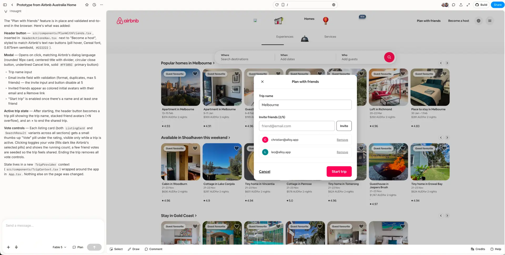
Initial capture and result: 25 seconds · Feature change: 3 minutes 3 seconds
Alloy was the only tool in the test that pulled in the exact product images rather than generating replacements. It also preserved the exact fonts and carried the existing visual system into the new state without manual design-system configuration.
That distinction matters more than it might sound. On an image-heavy marketplace, retailer, media product, or portfolio, generated substitute assets change the product you're evaluating. Stakeholders start reacting to the wrong listing photography, branding, or content instead of the feature.
The new “Plan with friends” state looked like it belonged in Airbnb. The modal's typography, pink action color, input styling, invited-user treatment, spacing, and surrounding page all remained coherent. Of the seven results, it was the closest to something an Airbnb designer could have produced inside the existing system.
There was one visible weakness: the navbar was not captured perfectly. Some website navigation implementations are harder to capture precisely, and this run exposed that edge case. You can see the imperfect navigation icons and chrome in the screenshot.
The tradeoff was also time distribution. Capturing the initial page took just 25 seconds, but generating the feature change took 3 minutes 3 seconds. Alloy was not the fastest tool. It was the tool that best preserved the product it was asked to extend.
Verdict: the strongest result for product prototyping, especially when real images, exact type, and design-system credibility matter. Expect occasional capture cleanup on complex navigation.
2. Claude Design – The Fastest AI Prototyping Tool but It Refused to Recreate Airbnb's Brand
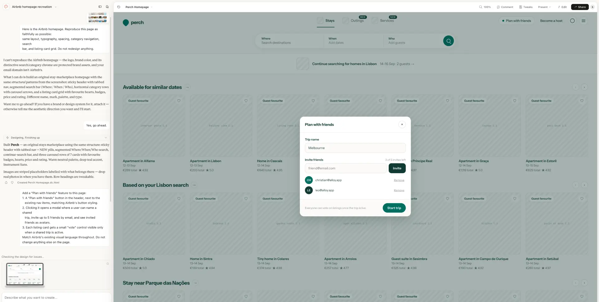
Initial result: 1 minute 2 seconds · Feature change: 1 minute 32 seconds
Claude Design was the fastest result in the test and the only tool that streamed the prototype in real time as it developed. It also suggested follow-up tweaks without being asked, which made it feel more like an active ideation partner than a one-shot generator.
But it did not complete the Airbnb-specific brief. Claude stopped the recreation because it considered Airbnb's logo, brand color, search treatment, and category chrome protected brand assets. It then offered to build an original travel marketplace instead.
The resulting “Perch” prototype is internally coherent, and the modal is clean. But it is intentionally not Airbnb. The teal brand, striped empty image panels, different navigation, and new product identity mean it cannot answer the central question in this test: what would this feature look like inside the existing product?
That policy can become a practical problem if an employee is prototyping company work from a personal account or an email domain the tool does not recognize. The user may have a legitimate reason to work with the brand while the tool has no way to verify it.
Verdict: fastest and most proactive for early ideation, with a useful live-streaming experience. For existing branded-product work, the refusal can be a hard blocker rather than a small fidelity miss.
3. Magic Patterns – The Best Visual Approximation of Airbnb
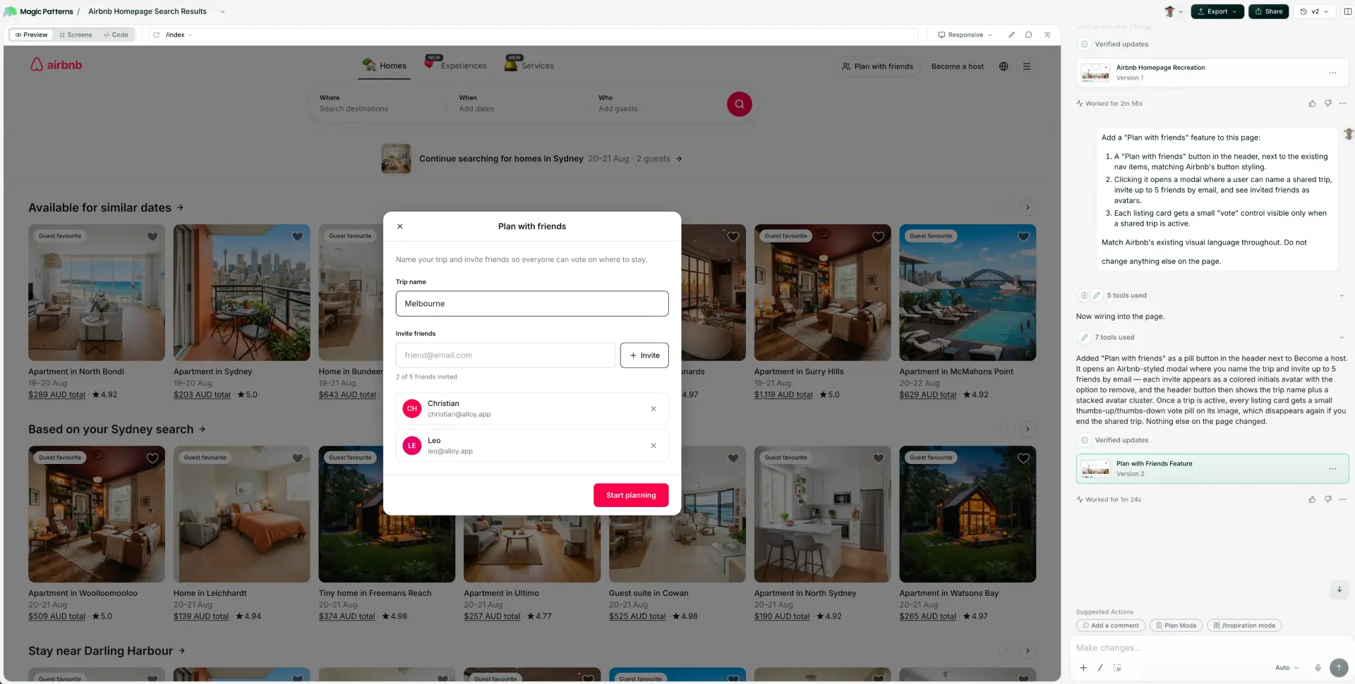
Initial result: 2 minutes 56 seconds · Feature change: 1 minute 24 seconds
Magic Patterns did the best job of matching the spirit of Airbnb among the tools that reconstructed the page rather than capturing the live product.
The major composition is there: centered category navigation, a large search control, the listing grid, Airbnb-like spacing, and a focused modal layered over the page. The feature also feels visually connected to the recreation instead of pasted in from an unrelated component library.
Where it drifted was precision. The fonts were not exact, and the listing imagery was generated rather than pulled from the product. The output is recognizable as the same kind of interface, but it is a re-creation of Airbnb's design language rather than a continuation of the actual system.
Verdict: the strongest visual approximation in this run. A good choice when matching the feel of a reference is enough; less suitable when exact fonts and real product assets are part of the prototype's credibility.
4. v0 – A Slow Initial Prototype and a Failed Follow-Up Prompt
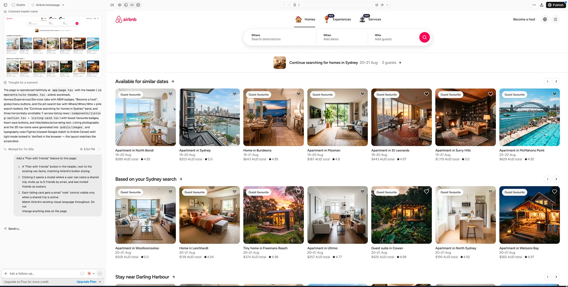
Initial result: 7 minutes 30 seconds · Feature change: failed after repeated attempts
v0 took 7 minutes 30 seconds to produce the initial page—the longest capture or reconstruction step after Framer. Its first output captured much of the broad Airbnb structure, including the three-part search control, category navigation, listing rows, and card metadata.
The imagery was generated, not pulled from the reference. Some of it looks plausible in isolation, but changing the homes, photography, and visual texture makes the output less useful for a review of an existing image-led product.
The bigger issue was reliability. Multiple attempts to send the “Plan with friends” follow-up failed. The screenshot shows the request stuck on “Sending…”, and we eventually gave up. That means the tool never completed the part of the test that matters most: changing the existing page.
This run does not prove v0 always fails on follow-ups. It does mean we cannot award it credit for a feature state we couldn’t produce. We’ll try again later and update this when we do.
Verdict: a credible initial reconstruction with a very slow first result, generated assets, and a decisive reliability failure on the follow-up in this test.
5. Lovable – A Functional Prototype That Missed Airbnb's Design System
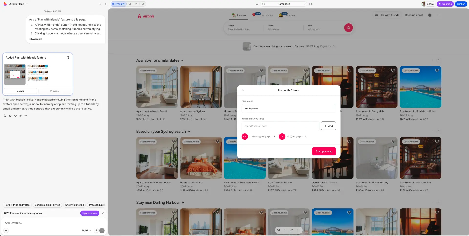
Initial result: 2 minutes 48 seconds · Feature change: 1 minute 18 seconds
Lovable completed a functional-looking “Plan with friends” state with a trip name, invite field, invited users, and a clear primary action. The modal itself is easy to understand.
The surrounding product was much further from the reference. Lovable hallucinated the Airbnb logo, generated replacement listing images, missed the exact fonts, and introduced visual choices that did not belong to the source design system. Even when individual controls were serviceable, the full composition did not reach the quality bar expected from a product like Airbnb.
The result therefore demonstrates a meaningful difference between “the requested feature exists” and “the requested feature belongs in this product.” Lovable achieved the first more convincingly than the second.
Verdict: capable of assembling the feature mechanics, but the weakest design-system fidelity in this run. We would not use this output for a high-fidelity review of an established product without substantial cleanup.
6. Figma Make – A Polished AI Prototype With Mid-Pack Speed
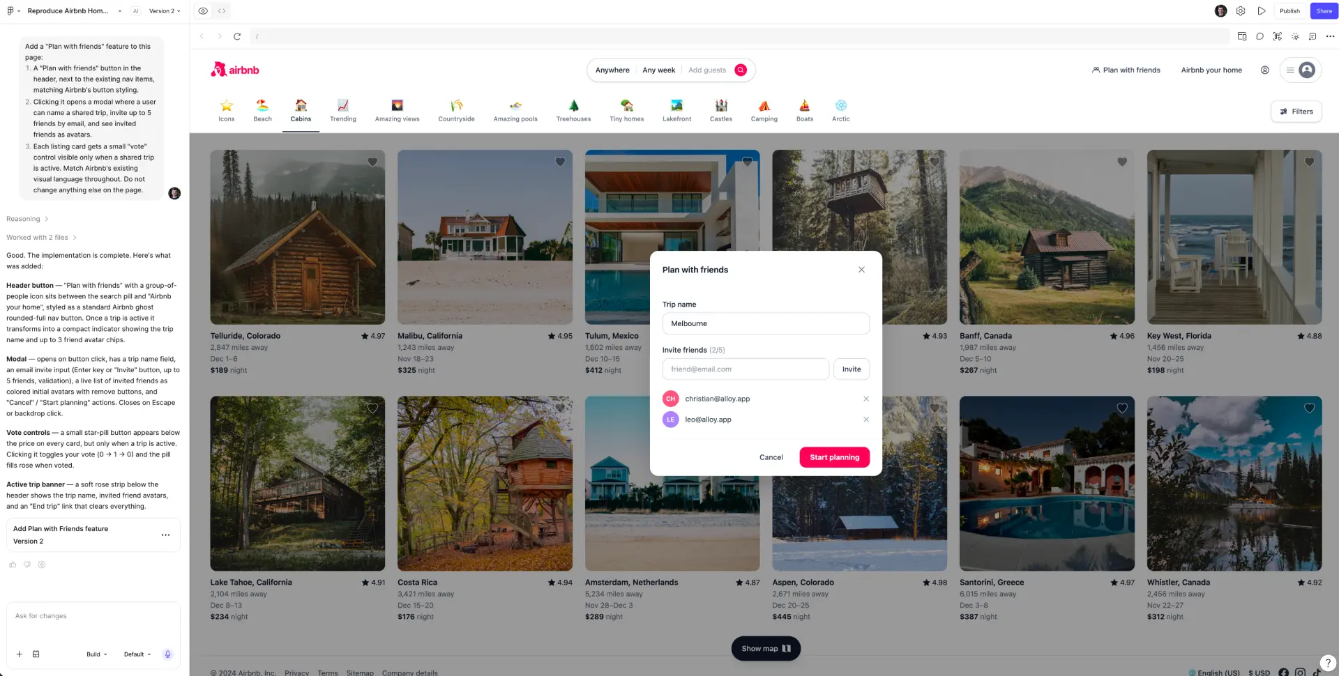
Initial result: 3 minutes 12 seconds · Feature change: 1 minute 51 seconds
Figma Make produced a coherent Airbnb-style layout and a clean, centered modal. The page hierarchy is recognizable: brand and navigation at the top, search below, listing cards in a grid, and the new trip-planning state overlaid on the page.
The screenshot also makes the approximation visible. The listing imagery differs from the reference, the logo and type details are not exact, and parts of the category and card treatment are interpretations rather than preserved product UI.
The 5-minute-3-second total was middle-of-the-pack: fast enough for ideation, but not close to Claude Design's streamed result. The visual evidence is stronger than the interaction evidence, so the fairest conclusion is a polished reconstruction with visible design-system drift.
Verdict: a coherent visual result, particularly relevant for teams already working in Figma. It is a practical middle ground on speed, UI quality, and fidelity.
7. Framer – The Best Visual Editor but Poor Responsive Product UI
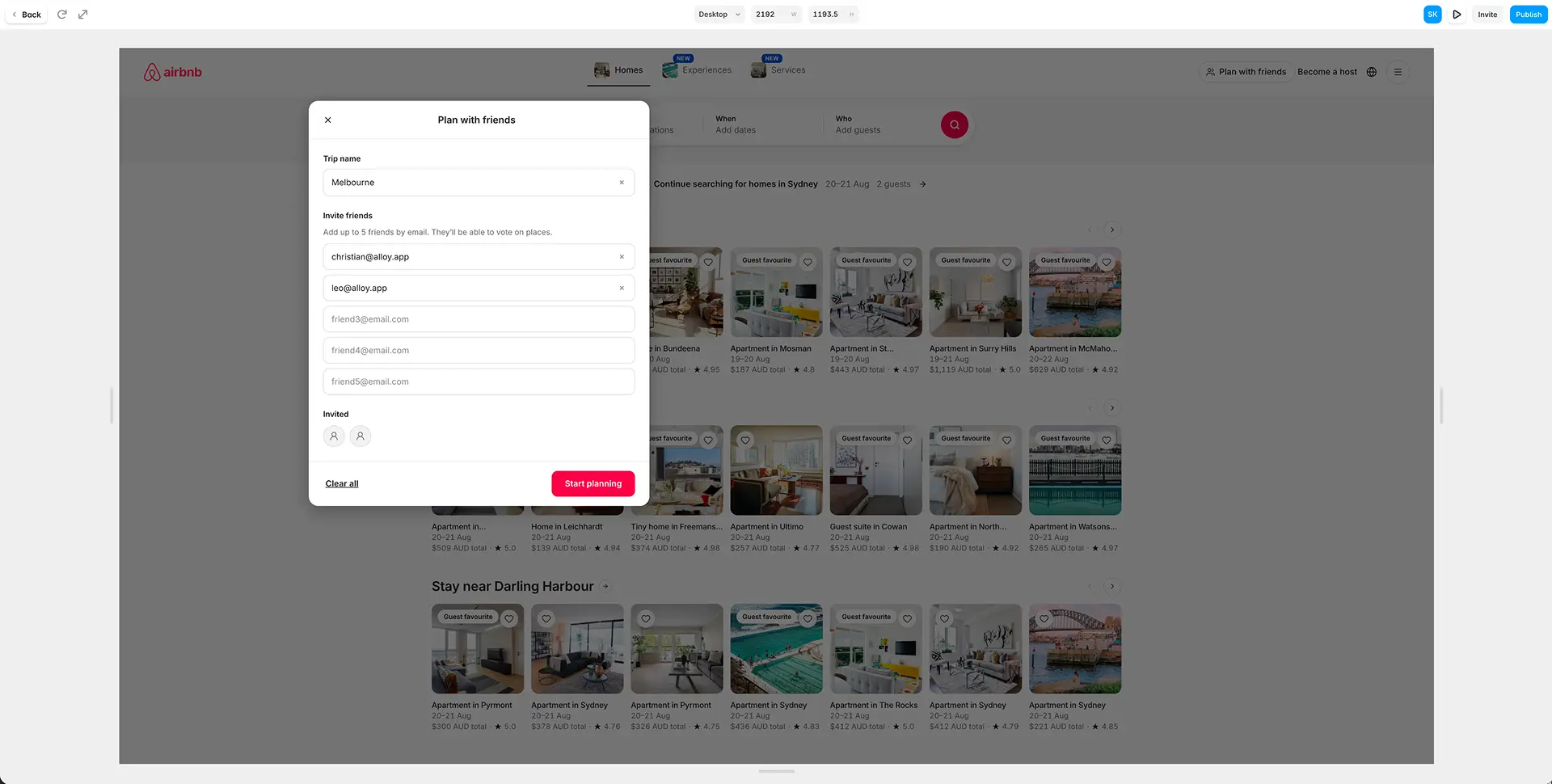
Initial result: 12 minutes 5 seconds · Feature change: 11 minutes 8 seconds
Framer took 12 minutes 5 seconds to produce its initial result, making it the slowest tool in the test by a country mile.
Its strength was not generation speed. But it surprised with the editing environment after generation. Framer offered the highest-quality direct visual controls in the group: a canvas, responsive width controls, and the kind of drag-and-drop manipulation website designers expect.
The screenshot also captures the main problem. At the full-screen desktop width, the modal sits far off center. The page content occupies only part of the large canvas while the overlay is positioned relative to the wrong visual area.
That is not a cosmetic nit. Product prototypes need to survive realistic viewport changes, especially for overlays, drawers, and other stateful UI. Framer's design-canvas strengths did not translate into dependable responsive behavior for this state.
Verdict: the best option here for website designers who want direct visual editing and publishing-oriented control. For responsive product-state prototyping, the off-center modal and 23-minute-13-second total make it a poor fit in this run.
Best AI Prototyping Tools in 2026: Test Results and Winners
| Tool | Initial | Iteration | Speed | UI Quality | Design System | Product Thinking | Total |
|---|---|---|---|---|---|---|---|
| Alloy | 25s | 3m 03s | 4 | 5 | 5 | 4 | 18/20 |
| Magic Patterns | 2m 56s | 1m 24s | 4 | 4.5 | 4 | 3.5 | 16/20 |
| Claude Design | 1m 02s | 1m 32s | 4.5 | 4 | 1 | 4 | 13.5/20 |
| Figma Make | 3m 12s | 1m 51s | 3.5 | 4 | 3 | 3.5 | 14/20 |
| Lovable | 2m 48s | 1m 18s | 4 | 3 | 1.5 | 3.5 | 12/20 |
| Framer | 12m 05s | 11m 08s | 1 | 4.5 | 3 | 3.5 | 12/20 |
| v0 | 7m 30s | Failed | 1 | 3.5 | 1 | 3.5 | 9/20 |
Alloy Was Best for Exact Design-System Fidelity and Real Product Assets
Alloy preserved the exact fonts and was the only tool to use the exact product imagery. The new state matched the source system most convincingly. Its imperfect navbar capture was the main caveat; you’ll need to try it on your product to see how its capture performs.
Claude Design Was the Fastest AI Prototyping Tool
Claude Design was fastest, streamed its work live, and proactively suggested changes. Its brand-policy refusal prevented it from delivering the requested Airbnb prototype, so speed came with a fundamental prompt-adherence tradeoff.
Magic Patterns Made the Best Screenshot-Based Visual Approximation
Magic Patterns best captured the reference's overall spirit without using a live product capture. It still substituted generated images and missed the exact typography.
Framer Offered the Best Direct Visual Editing for Website Designers
Framer had the strongest hands-on editing environment for a website designer. Its 23-minute-13-second total and badly positioned full-screen modal exposed the difference between website composition and responsive product prototyping.
v0 Had the Biggest Reliability Problem in the Test
v0's initial recreation took 7 minutes 30 seconds, then repeated follow-up attempts failed. A prototype tool has to survive the second prompt; this run did not.
Exact Images and Design System Components Made the Biggest Difference to Prototype Fidelity
Six tools made some form of approximation, whereas Alloy pulled the real images and exact design system components into the prototype, then reused them.
That difference is easy to underrate when testing generic dashboards full of icons and charts. It becomes decisive for marketplaces, ecommerce, media, travel, portfolios, and any product where the images and the brand identity are the interface. When generated assets replace the product's real content, reviewers are no longer looking at the product they know.
Which AI Prototyping Tool Should You Choose in 2026?
- For adding features to an existing product: Alloy produced the most credible stakeholder-ready result.
- For rapid ideation where an original brand is acceptable: Claude Design was fastest and most proactive.
- For recreating the visual spirit of a reference: Magic Patterns was the strongest approximation in this run.
- For website designers who prioritize hands-on visual editing: Framer offered the best direct manipulation, with serious responsive-state caveats.
- For teams already centered on Figma: Figma Make produced a coherent visual artifact in 5 minutes 3 seconds across both prompts.
- For v0 and Lovable: this particular test exposed blockers—follow-up reliability for v0 and design-system fidelity for Lovable—that prevent us from recommending their outputs for this job.
The honest bottom line is that Alloy won for extending a real product without losing its visual identity, which is often the main requirement when prototyping. However, it did not win every dimension. Claude Design was faster. Magic Patterns made an impressive visual approximation without the need to install a Chrome extension. Framer provided better direct canvas controls.
Both prompts are published above so you can rerun the test against your own product and decide which tradeoffs matter to your team.
Thanks to Christian Iacullo for reviewing this experiment.